Tags
Adventure, Book, Collaborating, Fiction, Formatting, Publishing, Research, Self Publishing, Writing
Dear Readers,
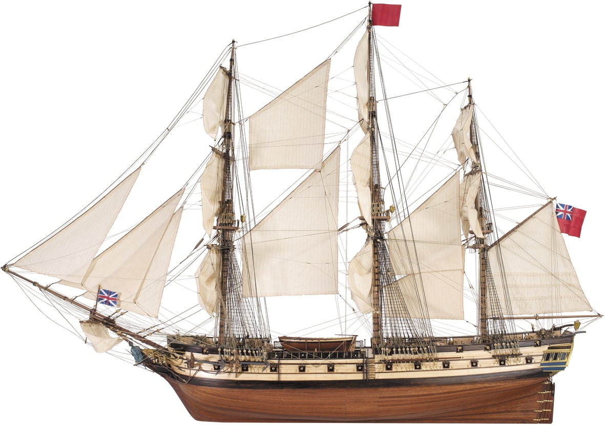
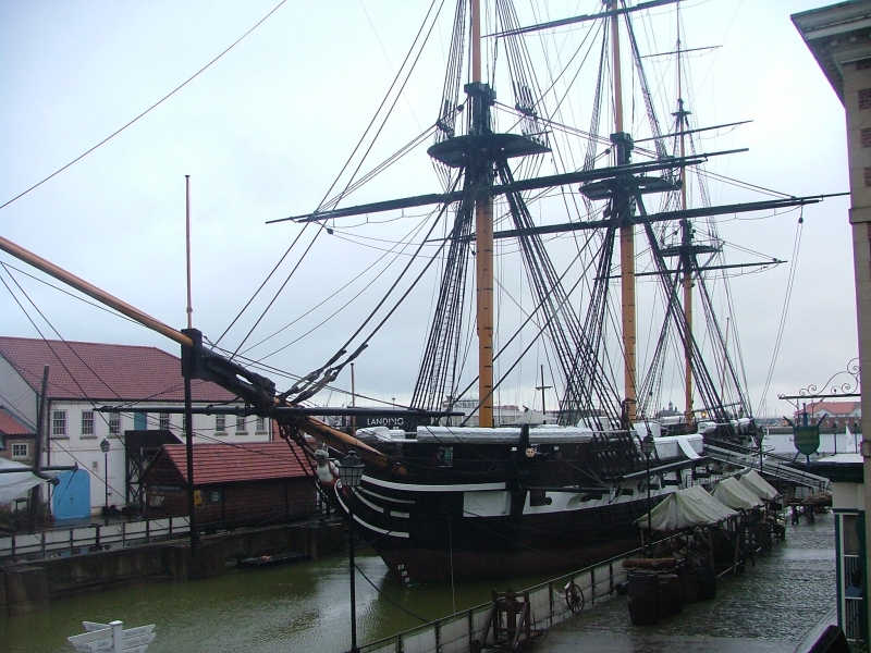
In our previous posting, we spoke about delaying—but not belaying—publishing our final manuscript of Across the Doubtful Sea. We have certainly put a considerable amount of work into our writing, as it was, in part, a learning experience: what works in a collaboration, the topic of 18th century south seas exploration, and, for one of us, it was her first novel. As we are nearing the final publication of Across, we’ve reached yet another important step in the process: formatting.
Our project is an entirely self-published book, meaning that we are not only the authors, editors, and publicists, but designers and formatters of our own book, as well. If we had decided to publish our book traditionally, the formatting would have been done for us by a professional working for the publishing company. Of course, we could have paid a professional anyway, as there are several publishing services for authors who’d rather “keep their sanity”—and we’re glad that they’re there—but, in our case, we were up for the challenge, and prefer completing the entire book ourselves.
An advantage of being authors in this decade is the availability of information through the internet—we are already making use of this by publishing online, and reaching you, our readers, and sharing our research and behind-the-scenes work through our blog, Facebook page, and twitter. As this has been a learning experience for us, the first thing we thought to look to for formatting was how-to book formatting guides. CreateSpace.com, the self-publishing site of Amazon that we will be using to publish Across the Doubtful Sea, has an easy to understand formatting guide for those using their site.
This guide has been incredibly helpful in building a structure for our book—in fact, as important as the research, creating the story, and writing the words. Why? The design and formatting of our book are, in a sense, the equivalent of giving a body to a soul. A book such as ours should have a proper format—a proper physical appearance to match what we believe to be a beautiful story. We read a number of articles on book formatting—some seemed to challenge first-time formatters, with titles such as “The Problem with Amateur Book Interiors,” but all gave solid advice as to how to avoid the common less-than-professional look of an independently published book.
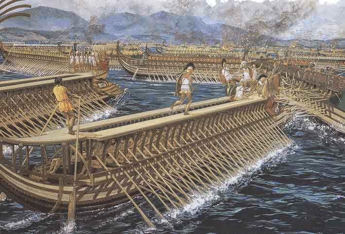
As with any exterior, we need to have a cover that will both attract attention and provide a small taste of the book. As often as it is said that a book should not be judged by its cover, a good cover makes all the difference in the book’s appearance. For Across the Doubtful Sea, we’ve chosen a somewhat dramatic painting by William Hodges, A View of Cape Stephens in Cook’s Straits New Zealand with Waterspout, 1776, with kind permission of the National Maritime Museum, Greenwich, London. The picturesque aesthetics of the painting already set a tone for what the story itself may look and feel like. In a way, the cover for the book is the face, with readable expressions that interpret what is on the inside.
Before we began, we took a quick look at formatting styles of books in the 18th century—the time period in which our story takes place—out of curiosity and to see what inspiration could be drawn from there. This also gave us the ability to pay particular attention to how a book is put together, rather than a printed manuscript directly from Microsoft word, as we are used to seeing. There are many styles of formatting, as well—for our book, we chose to include page numbers and the title at the top of each page.
Pagination for our book was when we realized how long our book really was, as a finalized, complete novel. Page numbering was the first real step in giving the manuscript physical form, along with the 52 chapters—we foolishly presumed earlier in the process that we might have stopped at 24, then 48, and then… And, as with any book with several chapters, it involves tedious, yet rewarding, work—we’re quite close to completing the project we began during the summer—but 52 chapters can promise that it won’t be a process to be rushed through. Meticulously following advice from the formatting guide, as well as the aforementioned articles about self-publishing, we placed after each chapter, and each chapter title was placed with the desired font and size. Correct margins also had to be set, keeping in mind that the pages would be bound as a book.
At this stage—even after reading through and editing the entire manuscript—there was a need for a final check on names and their continuity—after all, we invented or adapted languages for this book. Some things, even at this stage, had either been changed, or still needed to be—which is where we learned an important rule for the future—be careful when changing names! Because of words and terms used by the characters in Across, we’ve included a glossary of terms and names at the beginning. We want to take as much care in making sure that our readers understand words in the languages as we did in creating them.
Even now, there is still some work to do—polishing up, working on final font designs, and, then, dear readers, you will have the chance to take a look for yourselves.
Thank you, as always, for reading!
CD